How do we spend our Restless Energies?

Does individual change lead to system change or is it just a diversion, a distraction strategy?
Can we get our Adaptation Trojan Horse inside Mitigation’s walls?
Unearthing a hidden gem from the latest IPCC report that might provide clues for our energy allocation.
Restless Energies are at the heart of the Leading Through Storms Framework - spinning out along the four pathways to Spirited Leadership.
But how do we apportion our Restless Energies? How can we decide where to place our attention? The four interdependent pathways are both individual and system-wide (apart from “training body and mind”) but nonetheless I find myself constantly wrestling with how to apportion my energy along that continuum.
In this short blog I’m going to unearth a hidden gem from the latest IPCC report and suggest that it might provide clues for our energy allocation. I then invite you to read the IPCC Report (don’t worry, just the short 36-page version - link below) and join me in a discussion in the Leading Through Storms (LTS) Monthly Monday on August 21st - this might be the first LTS Reading Group….
A key characteristic (both a benefit and a hindrance) of the IPCC Reports is the consensus-based process which produces them. Every word is crawled over by scientists and government representatives of all complexions. So reading them not only puts you into the brains of thousands of scientists, it tells you what they have all agreed on.
With our interest in Adaptation, I’m going to focus on those elements of the short AR6 report which deal with adaptation. Early on the scene is set - “adaptation does not prevent all losses and damages”. This is a strikingly calm statement for a truly horrible set of outcomes – whatever we do, we can’t avoid at least some consequences. Not quite the deal we thought we had signed up to in Paris in 2015.
It's relatively new for adaptation to feature prominently in IPCC reports. Ever since Paris 2015, mitigation has been the name of the game - “how can we avoid breaching 2 or even better 1.5 degrees?”. But now the game is up – there is widespread acceptance that we won’t stay below 1.5 degrees. The consequences are clear in the report - “Climatic and non-climatic risks will increasingly interact, creating compound and cascading risks…” Not quite collapse, but definitely collapse-adjacent.
There is much in the AR6 report to contribute to discussions on the probability of collapse. Medium, high and very high confidence levels are accorded to various future scenarios. When we are told that the window of opportunity is closing and they have a very high confidence of that, somehow the hammer blow is more forceful. Of course, a number of us now believe “no more information is needed” to spur us to action, and suspect that calls for more data and evidence are often smokescreens to delay change and maintain business as usual. Whether you are in that camp or not, perhaps we ought to live with a bit of dissonance and grant other leaders their wish for more information and hope this latest delivery tips them into action. You might wish to read the report (the short version at least) but just in case, in what follows I’ve picked out for you the key paragraphs:


For me, all of those excerpts project the prospect of collapse without mentioning the word itself. Remember, this isn’t the output from a campaigning NGO, it’s the considered and agreed conclusions from thousands of scientists. The words are still moderate – “warming” not “heating”, “potentially disruptive changes”… and what is “maladaptation” if not another word for collapse? There is a dreadful future lurking here, but I find I have to re-read these highlights to uncover its true horror.
I promised you a hidden gem. Buried towards the back of the report is SPM7, a chart which, if it triggers the action it should, could take its place alongside the global heating “hockey stick” graph and the Apollo 17 Blue Marble Earth photograph as one of the defining images of humanity’s climate change journey. Here it is, with its introductory panel and below it the detailed explanation of what it shows. As you have read this far, please do invest the time to drink in everything that it has to offer.

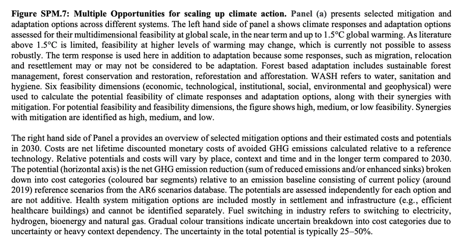
There’s a huge amount of insight and guidance contained in that chart. If you’d like to dig into it with me and others, join the Monthly Monday discussion on August 21st. Just look at the size of the bars on the right and what they relate to, and you’ll see the vast majority of the biggest mitigation effects come from systems change - how we generate electricity in particular. The big mitigation areas are all in land based systems like agriculture and forestry. But, with our interest in adaptation, look at the “Synergies with Mitigation” column of blue boxes down the centre of the chart. The darker the colour, the stronger the synergy between the adaptation option listed on the left and mitigation. If mitigation is still forefront in people’s minds, how can we get them into the options that are also strong for adaptation? Can we get our Adaptation Trojan Horse inside Mitigation’s walls?
Then look at the options with the smallest mitigation potential (shortest bar on the right) and low adaptation synergy (lightest colour boxes). Many of those are rooted in individual choices (electric cars, cycling and recycling etc.) which we might all take and feel good about, but which don’t add up to much compared to the systemic change options further up the chart.
For many years, we’ve been exhorted to “do our bit” for the planet, to make changes in the way we live to make things better for the environment. If we were in charge of the big systems in the chart – power generation, industrial agriculture, construction – would we have felt the same pressure? These are now revealed as the most significant levers of change. What can we do to rebalance the emphasis on mitigation and adaptation?
There is certainly support from UN Secretary General Antonio Guterrez. He called for equal funding for adaptation and mitigation in his famous “Code Red for Humanity” speech in 2021:
“Adaptation and resilience finance must cease being the neglected half of the climate equation. Only 21 per cent of climate support is directed towards adaptation. I again call on donors and the multilateral development banks to allocate at least 50 per cent of all public climate finance to protecting people, especially women and vulnerable groups.”
So in 2021 the effort was 79/21 in favour of mitigation. It may have moved since, but from what I can see not as far as 50/50.
I’m still sorting out my thinking about this, perhaps you are too. I’ve become increasingly suspicious of how we are framed as individual consumers with the power to drive the change, and this chart seems to support that suspicion and the feeling that system change is where the action is. What do you think? Does individual change lead to system change or is it just a diversion, a distraction strategy? Where is your Restless Energy? Which of the four pathways would you redirect your leadership energies towards? For me, Formulating Creative Experiments and Catalysing Generative Relationships seem to offer the most potential, but I’m sure others will have their contributions to make.
This led to an uplifting, practical August 21st Monthly Monday. I’d love to read comments from those of you who couldn’t attend below too!
Simon
Reference: ipcc.ch/report/ar6/syr/downloads/report/IPCC_AR6_SYR_SPM.pdf